tweetz 3.0 - Beta
27 Jul 2010I have a dirty little secret to tell you. I don’t like tweetz 2.x all that much. It design was an experiment in that I added pretty much every darn feature suggested. In the end the program was very capable, but had lost some of it’s ease of use and personality.
Tweetz 3.0 represents reset where I went back to the original vision of a fun, easy to use, easy to understand gadget. Some of you probably won’t like it. That’s fine. Tweetz 2.x isn’t going away. It fix bugs but likely, the feature set won’t change much over time.
The good news is that you can run tweetz 2.x and tweetz 3.x side by side. Tweetz 3.x installs with a different name (tweetz 3.0) and location so you can try the new one without giving up your old reliable standby.
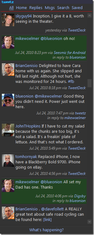
OK, without further ado, here’s some screen shots (docked and undocked).


The obvious change is that the icons are gone. I’ve never been a big fan of icons. Words seem to do better at communicating intent. Of course, the downside is they take up more screen real estate.
The other thing to notice that there are fewer on screen controls. They appear when you hover over the use image similar to what other twitter clients do.
There’s also a unified/consolidated view. This is something I wanted to add in version 1.x and then convinced myself that it was a dumb idea. Silly me. In my opinion, this is the best new feature of tweetz 3.0.
As you can see from the screen shots, tweets that you are “mentioned” in are highlighted in green. Direct messages also appear in the “All” timeline and are in blue. Tweets appear in chronological order.
Incorporating the “All” timeline made for some interesting challenges. In the end, I scrapped the tweetz 2.x data model and started over. Yep, tweetz 3.0 is a rewrite. It borrows heavily from the tweetz 2.x code base but is essentially a new program.
I’ve spent a good deal of time on performance, both memory and speed, in this code base. It should be able to handle a large number of tweets without excessive memory use or noticeable slow downs. At least, that’s the goal.
Many of you have asked about alternate themes. While this version uses the same dark theme of past, the code has been rewritten to accommodate style changes. Almost every aspect of the layout is specified in style sheets. I’ll allow different style sheets in the future. For now, you can modify the main one. If you come up with something cool, send it my way.
In the end, tweetz 3.x is about simplification. Getting just the right mix of functionality and ease of use without overwhelming. Some will see it as a step backwards and I won’t argue with that. However, if the overall experience is better then I think it’s a win.
Enjoy, send feedback and get tweeting.
Available on the downloads page.