Living with Windows 8
21 Oct 2012I recently replaced my laptop with a Zenbook (great laptop/ultrabook that I’ll talk about another time). As is so typical in the PC industry it had a bunch of crap on it I didn’t want and 20% of the hard drive was wasted on hidden partitions for recovery and diagnostic utilities. On large disks that’s not a issue but I only have a 128 GB SSD so those bytes are valuable real estate to me. After wiping the disk (and peeling off those stupid “Intel Inside” stickers) I was faced with a decision, Windows 7 which I know and love, or Windows 8. For the impatient, I went with Windows 8 and the bottom line is I’m glad I did.
Installation
Installing from a USB stick was very straightforward and works much like in the past. The only “new” thing I encountered was the installer wanting to me to create an account for synchronizing settings and buying stuff from the Microsoft App Store. I opted not to register figuring I can do it later. That’s what I would recommend doing. No sense in committing to something until you need it.
Boot up
Awesome. I’ve never put a stop watch on it but from power on to login screen is under 15 seconds. That’s a huge and welcomed improvement. The login screen is a bit different and my cause some confusion. I’ve seen others blog that you have to swipe up/down before you can type your password in. They’re wrong. You can simply hit any key (you do know where the any key is, right?) or move the mouse. The login prompt comes up and you can start typing.
Restart
I’m like most laptop users in that I never turn it off. I just close the lid and let the laptop go into sleep mode. Waking up is very quick. Open the lid and in about a second it’s awake and ready for a password. Another welcomed improvement.
Start Menu
One of the biggest and jarring changes in Windows 8 is the replacement of the desktop start menu with a full screen, tiled application. I have to admit, this was the thing I was dreading the most. Turns out it’s not that big of a deal. Am I in love with it? No. But it doesn’t suck either.
If you’re a power user you likely launch your programs by pressing the Windows Key and typing the first few letters of the command or program and pressing enter. It works exactly the same in Windows 8 except you transition to new full screen, tiled start menu. The transitions are “Fast and fluid” and don’t feel the least bit “bumpy”. That actually helps a lot in keeping the experience pleasant and not cognitively disruptive. My advice, try it for a while. For me, after an hour I stopped caring about the differences.
Speed
Yeah, it’s faster. I don’t have benchmarks or other measurements. Windows 8 just responds faster than Windows 7 in most situations. The transitions are fast and never feel “tired”. I’ve been using Windows 8 for about a month now running all my usual stuff and it doesn’t feel like it’s bogging down in the least. Does it help that I have an SSD? You bet it does. But even accounting for the SSD, there’s something just “more right” about Windows 8.
Look and Feel
Aero is dead. May it rest in peace, The flat look of Windows 8 is oddly welcoming and unexpected. The one thing I don’t care for is the huge borders on the windows. They look cartoonish to me. Even in Windows 7 they looked silly. Fortunately, there’s a fix. Unfortunately, it’s a registry hack. The other annoyance is that the toolbar is transparent and can not be made otherwise. Sorry Jenson, but I simply don’t agree.
Apps
I have yet to find one App that I like and use. I just can’t get my head around why I need a full screen application to listen to music. Maybe I’ll change my mind but for now I’m simply not interested in Apps. On portable, touch based devices they make more sense but not here on my laptop. I prefer desktop gadgets.
Other Niceties
The new task manager is much better. I use Sysinternals Process Explorer in Windows 7 but the Windows 8 task manager meets 95% of my needs. Process Explorer only comes out when I need something special.
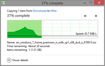
The progress dialogs for file copying and transferring are vastly improved. Click the “More details” link on a file copy or other system progress dialog and you’ll get a neat little real-time graph which (gasp!) has actual useful information. Seriously, it’s almost worth upgrading for this feature alone.
The built-in virus protection is quiet and unobtrusive.
Internet Explorer 10 works nicely. I still use Chrome but when I have to use Internet Explorer, I no longer cringe.
Windows Key + X brings up a menu with most of the useful administration stuff I use to get from the start menu.
Conclusion
I’m pleasantly surprised at how nice Windows 8 is. There are a few areas that still confuse or annoy me at times but overall I like it better than Windows 7. This is something of a surprise because I went in fully prepared to hate Windows 8. There are differences for sure, but improvements in performance and function outweigh those differences.
For a more detailed Windows 8 user experience, Scott Hanselman’s “Who Moved my Cheese” is a good read.

